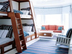
Modern Children’s Room planning. Part II.
December 20th, 2008
The first thing to plan in any room that is going to be both bedroom and play space is storage. Children, even babies, have a lot of belongings - toys, clothes and equipment of various kinds - that are going to accumulate with the years. Where are you going to put it all?
For an average, say 4X3 metre (12 X 10 ft) room that has no existing cupboards, either build in a full-length double cupboard, floor to ceiling, or buy a sturdy, roomy second-hand wardrobe. It really is
false economy to bother with any of those specially built mini cupboards that may look rather sweet but become obsolete in no time at all.
In the very early stages, your basic cupboard/wardrobe can be divided in two. Use one side for hanging space, with perhaps one rail at waist level and either another rail or removable shelves above. These can be removed as the child’s clothes get larger and longer. Fit the other side with well-spaced shelves and use it for toy storage; later on it will be useful for sweaters, shirts and a lot of chunky, bulky clothing.
 You will also need at least two chests of drawers. Unpainted wooden chests of drawers are inexpensive and perfectly adequate. Or you can buy a modern furniture from us. Set them against the wall leaving a knee-hole space in between (to form an eventual desk/dressing table) and top them with some sort of easily cleanable laminate surface. If these can run along the length of one whole wall so much the better: such an arrangement looks neat and tidy and these are words you are going to be using a lot over the next ten years.
The drawers can be used for nap-pies, night clothes, underwear, talc and all the other baby necessities in the beginning as well as for an over-flow of toys. Later the same drawers will take other clothes, other toys, other games, school work and general clutter.
The long run of work surface along the top of the chests can first be used for changing the baby, then for play (painting, drawing, cutting out) and later still for school work and displaying possessions. The actual chests can be painted, lacquered or otherwise decorated, many times over the years in whatever style happens to be in keeping at the time.
Against the wall behind and above these units it would be a good idea to build a series of shelves or shelves and lockers interspersed with pinboards and space for drawing and the inevitable posters and pictures of pop stars. Make sure all drawing pins are out of reach of toddlers.
In the first instance, shelves can hold soft toys later giving way to books, records, files. The pinboard takes progress charts and nursery information to start with and can carry on into school years to provide space for homework timetables and general reminders.


 Make your living room more romantic, increase the wattage of the light bulbs to 100 or 150. (It’s essential that your lamps are labeled to accept this wattage; if not, they’ll need rewiring, which may cost about $30.) Then install dimmer switches and dial the brightness down. You’ll get a golden-yellow light that encourages intimate conversations.
 Keep in mind that walls, floors and other elements in a bedroom also have textures that add to the ambience of a room. A smooth brass headboard contrasts nicely with a tapestry bedspread. Polished hardwood flooring provides a beautiful surface that sets off a plush area rug perfectly. Effectively combining patterns to create a desired bedroom decor can be a bit confusing and somewhat intimidating. Today, many textile manufacturers are making things easier for their customers by offering such coordinating elements as fabric and wallpaper together, to make the whole process easier.